Custom
Websites
Websites
Custom
Websites
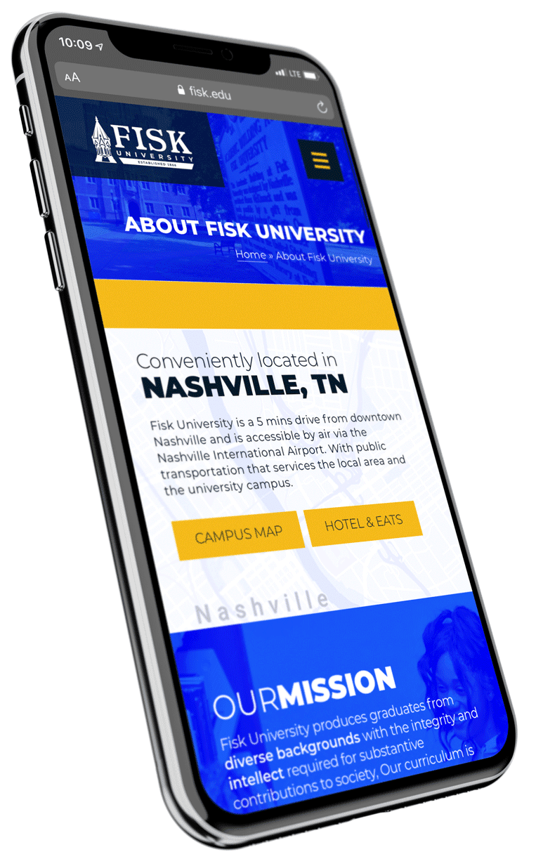
A Franklin web design and marketing agency for 20 years. Voted #1 best web design, web development & SEO company in Franklin Tennessee. Our website design team has the expertise to build high-end websites that have a mobile responsive design, a firm online brand and an interactive web design strategy. JLB has designed thousands of websites and manages over 800 web design clients today. We have the experience.
+ Learn More